Premium Class Experience
Company: Alaska Airlines
Skills: Interaction Design, Prototyping, Usability Testing, Motion Design, Design Systems
Benchmark
I’m a firm believer that you must be aware of the competitive landscape; and not just limited to direct competitors. This insight might give rise to inspiration, but equally important is understanding the paradigms used so you can align with conventions and standards familiar to users.


Seatmap Iconography
One of the tasks running in parallel was an exploration of the seatmap iconography. Up until this point, we only had to communicate three difference seat choices. The introduction of Premium Class and Preferred Plus introduced two more choices. I collaborated with a team consisting of visual designers and researchers to define a set of icons to visually communicate seat tiers. We explored a number of options and launched dozens of tests to evaluate said designs. Through this test and trial we measured for comprehension of the glyphs while refining the designs to be mobile optimized.
Seat Upgrade Marketing
One of the key moments in the shopping experience was the education piece. Visitors would now see new options and we’d need to be able to communicate what the differences were. The banners below were one of the many considerations in this, and would be displayed on both the Seat Preview from the search results, as well as on the Seat Selection page within Checkout. These two went through user testing to measure ability to capture attention, comprehension and influence to upsell.

Symbol Library
I became the seatmap subject matter expert among the design team and so I took it upon myself to curate a symbol library of sorts. At first this was used as a visual to facilitate conversations around the subtle differences between the various Boeing airplanes, along with the variations throughout the transition. From what I’ve been told, this library is still used and saved a number of hours in design work, freeing up time from production work.
Invision Prototype
One of the tools I used frequently at Alaska Airlines was Invision for quick click-through prototypes. I had a number of iterations to the Premium Class shopping flow. Below is a timelapse of just one of them to capture the magnitude of work I’d put into these.
Seatmap Notifications
One of the discoveries from implementing Premium Class is that some seats were flagged for accessibility or unattended minors so we had to address these. How would we explain to a customer that they might need to be reassigned from this upgraded seat they are about to pay.
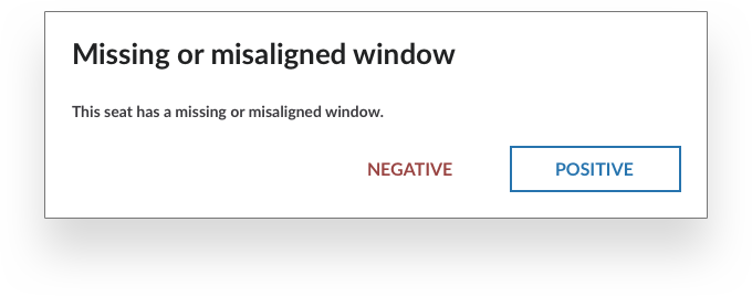
While we had the hood open, we decided to look at other scenarios. Customer service occasionally received calls from travelers complaining about seat selection which was missing a window. I decided to investigate what other concerns travelers might want to be aware of.
“the electronics box under the seat in front takes 40% of your feet space.”
“row 11 is a bit strange with missing windows but this is not a big deal”
“19a was pretty comfy excepted for the fact it had no recline”
The result was a proposal for various messages, with an emphasis on consistent patterns.


Mobile Motion Exploration
Along with the proposal above on varying notifications, I explored how we might present the best user experience on mobile. Having multiple popups just didn’t play out well, and would be quite painful on mobile. So, I pulled together a motion design using Principle to communicate one of my ideas.